Free: 96 PPC tools + my AI Playbook book

These are real hr software & payroll saas pages spending actual money on Google Ads right now.
From real hr software & payroll saas Google Ads campaigns in the US
The landing pages actually worth stealing from
So you know exactly what to avoid
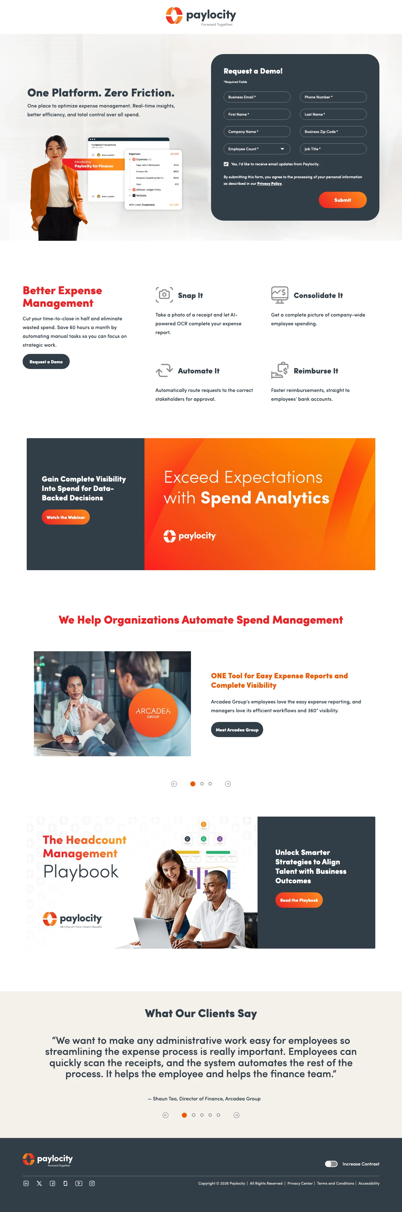
Build separate landing pages for each buying persona (HR director, finance director, CEO) rather than one page for all -- the finance persona cares about expense management and close-time reduction, not employee engagement or onboarding.
Persona-specific messaging ('Cut your time-to-close in half and eliminate wasted spend. Save 60 hours a month') speaks directly to finance professionals' KPIs rather than generic HR benefits -- this page knows exactly who is reading it
Three named case studies with specific outcomes (Arcadea Group's expense workflow, Medely's 12-to-6-day close reduction, Retool's approval automation) let the visitor find their company-size analog
The 'Snap It, Automate It, Consolidate It, Reimburse It' four-step process reduces expense management to a memorable sequence that fits on a slide -- useful for the finance director who needs to sell this tool to their CFO
The page targets finance professionals but the ad keywords ('getmoss', 'sync payments') are competitor brand and generic payment terms -- the visitor expecting a Moss alternative lands on a Paylocity expense management page with no competitive comparison
The demo form asks for job title and employee count but does not mention pricing anywhere on the page -- finance professionals are the most price-sensitive persona and will not request a demo without a ballpark cost
A webinar CTA ('Watch the Webinar: Exceed Expectations with Spend Analytics') competes with the demo form for attention and gives the visitor an escape hatch that delays conversion
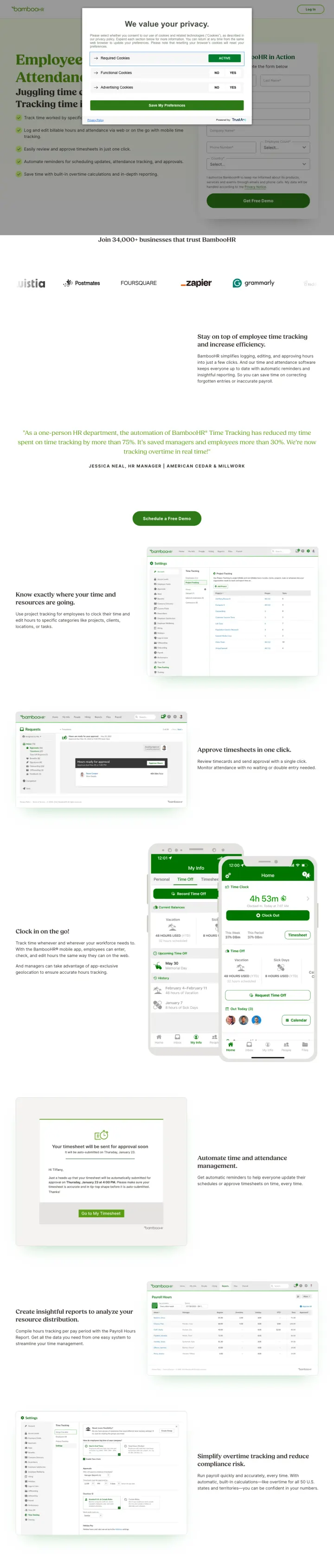
Build separate landing pages for each product feature (time tracking, ATS, payroll) with the form embedded inline next to feature-specific screenshots. Visitors searching 'time tracking software' want to see time tracking, not your full HR platform.
Inline demo form appears mid-page directly alongside time tracking product screenshots -- the visitor evaluates the feature and fills the form without scrolling to a separate section, reducing conversion friction
Four specific feature callouts (Clock in/out, Track hours and overtime, Manage PTO, Approval workflows) tell the visitor exactly what BambooHR time tracking does rather than vague 'streamline workforce management' language
Named testimonial with photo and title (appears to be a real HR manager) placed near the form to support the conversion decision at the point of action
The cookie consent modal that plagued BambooHR's main HR software page appears here too, covering the hero on first load -- this is a systemic issue across BambooHR's /pl-pages/ landing pages
G2 and Capterra badges appear at the very bottom of the page below the fold where few visitors will see them -- these should be positioned near the form
The page targets 5 keywords including 'connecteam time clock' (a competitor) but makes no competitive comparison or differentiation claims -- the visitor searching for a Connecteam alternative gets BambooHR features without any reason to switch
For global EOR landing pages, show country-specific starting prices in a visual grid alongside the demo form. The visitor needs to know 'can I afford to hire in [country]' before they will invest time in a demo call.
Country grid with flags and starting prices (Philippines, Mexico, India, UK, etc.) lets the visitor find their target country instantly and see the cost -- this is the global hiring equivalent of showing per-user pricing for SaaS
'Locally Pay Employees Around The World' headline with Afro + international imagery positions global hiring as accessible rather than complex -- the emotional message ('you CAN do this') complements the rational pricing grid
Compliance-focused sections ('Stay Compliant with Global Hiring Regulations') with country-specific detail address the #1 fear of companies hiring internationally for the first time
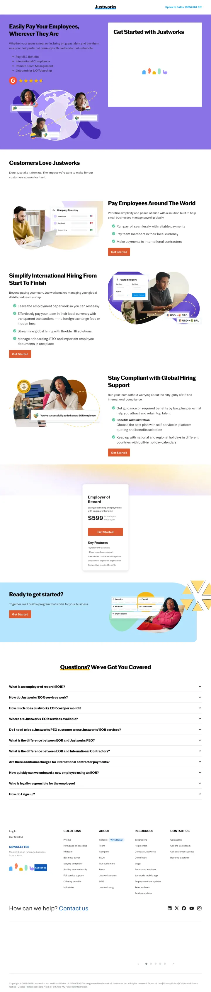
The form at the top asks for company name, employee count, and target country before work email -- this front-loads qualifying questions before establishing any value, which may feel like a sales qualification quiz rather than a helpful intake form
Integration partner logos (Gusto, QuickBooks, Xero, NetSuite) suggest Justworks is a layer on top of existing payroll rather than a replacement -- this could confuse visitors who expect a standalone solution
The 'Completed? We've Got You Covered' section at the bottom feels boilerplate and generic after the strong country-specific content above it
When selling US payroll to multi-state employers, lead with 'all 50 states' coverage and '300K+ payslips processed' to immediately address the two buyer fears: does this work in MY state, and has anyone actually used this at scale?
'Run US payroll in all 50 states' headline immediately answers the multi-state employer's first question -- a company with employees in Texas, California, and New York needs confirmation of universal coverage before evaluating features
Quantified scale metrics (300K+ payslips processed, 35,000+ companies, $14B+ processed) in a dark contrast band mid-page create a statistical proof bar that is hard to argue with
Interactive state map showing compliance coverage visually reinforces the 'all 50 states' claim -- the visitor can see their specific state highlighted rather than trusting a text claim
The page targets 'texas employer identification number' as a keyword, which is a compliance research query not a payroll software purchase intent -- visitors researching EINs are in a different buying stage than those searching 'payroll software'
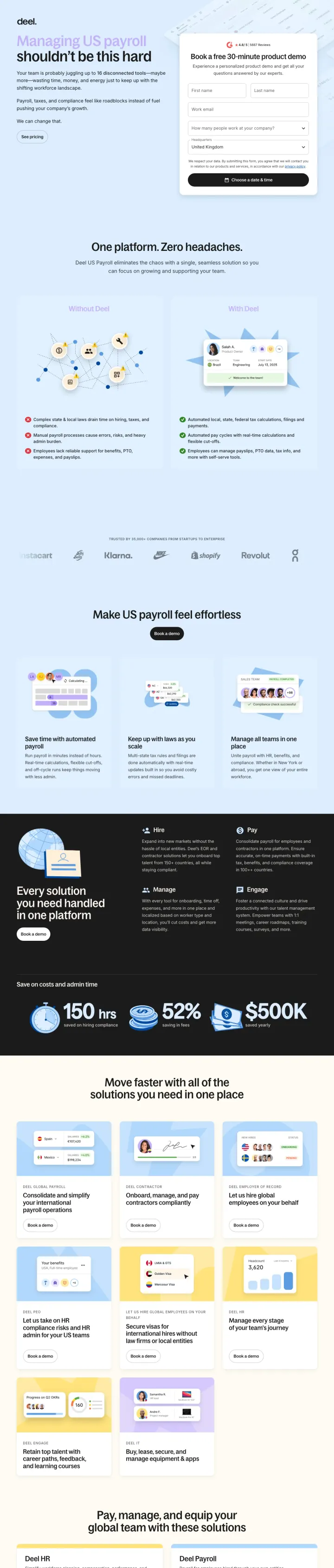
No pricing visible anywhere on the page despite Deel having transparent pricing on other pages -- US payroll buyers are comparison-shopping and expect per-employee pricing
The demo form is pushed below significant feature content, and the page architecture suggests Deel wants visitors to read extensively before converting -- this may work for global payroll but US payroll buyers are further along in their decision process
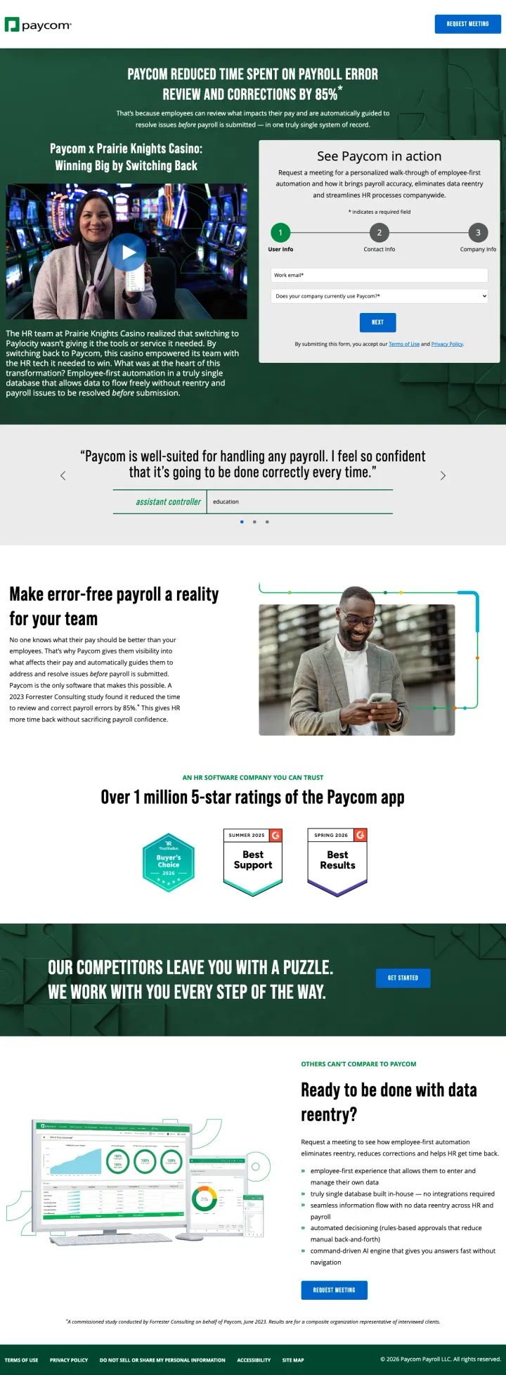
Lead with a named customer who switched AWAY from a competitor and came back -- 'switching back' stories are more persuasive than first-time adoption stories because they prove the alternative was worse.
The Prairie Knights Casino video case study names a specific competitor (Paylocity) that failed them, which is aggressive competitive positioning that works because it gives the viewer a concrete reference point for comparison
The '85% reduction in payroll error review and corrections' stat from a Forrester study appears above the fold as the page's opening line -- leading with a third-party-validated metric rather than a self-reported claim
Multi-step form (3 steps: User Info, Contact Info, Company Info) with progress indicators reduces perceived form length while still collecting detailed qualification data
The hero splits attention between a video testimonial on the left and a demo form on the right -- both compete for first click, and neither gets full visual weight
Role-based testimonials (owner, assistant controller, HR generalist) use job titles but no names or company photos, which undercuts the specificity of the Prairie Knights case study directly above them
The 'Our Competitors Leave You With a Puzzle' section uses confrontational language without evidence -- after the Prairie Knights story's specificity, this feels like generic chest-thumping
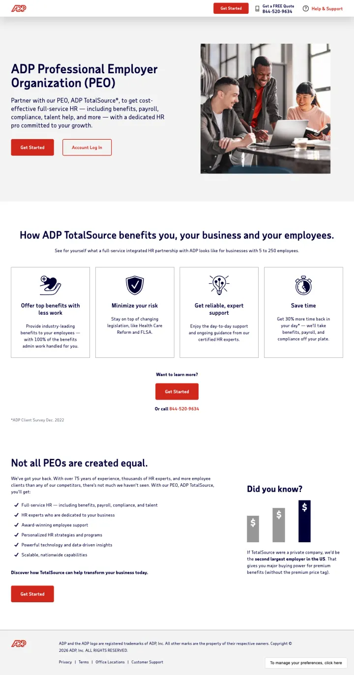
Lead with a competitor-frame stat. "Not all PEOs are created equal" + "ADP TotalSource is the second largest employer in the US" makes the category choice feel binary: use the biggest PEO or settle. Most PEO pages just list features. This one frames the buying decision before it lists anything.
The "second largest employer in the US" stat reframes the PEO buy as a trust bet. Small business owners outsourcing HR are giving someone else legal exposure on their employees. Scale signals resilience, and this is the single most persuasive number on the page.
Four clean benefit tiles ("Offer top benefits", "Minimize your risk", "Get reliable, expert support", "Save time") each tied to a specific data point ("Get 30% more time back in your day"). This replaces the typical feature dump with buyer-outcome framing.
Two primary CTAs ("Get Started" and "Get a FREE Quote 844-520-9636" in the header) serve both the research-mode shopper and the ready-to-talk buyer. The phone number in the header is unusual for SaaS and right for PEO where the decision moves through a salesperson.
The hero uses a stock team-at-laptop photo instead of the actual ADP HR experts customers would be outsourcing to. A named face or two from the TotalSource team would close the "who will really handle my HR?" objection.
No named customer logos or testimonials above the fold. For a buyer comparing ADP against Insperity and Justworks, specific company names carry more weight than the generic scale claim.
The "Not all PEOs are created equal" section hints at differentiation but never names a competitor or a specific "other PEOs do X, ADP does Y" contrast. The frame is set up but never delivered.
Pages that break the playbook in interesting ways
Instead of building one landing page for your entire platform, build narrow pages for specific HR pain points (visa management, contractor payments, compliance audits) -- depth on one problem beats breadth across twenty.
The 'Without Deel / With Deel' comparison section with bullet points (scattered spreadsheets and email chains vs. one place to manage every request) makes the before-state painful and the after-state obvious without any feature jargon
Support metrics (91% first-contact resolution, 1-hour issue resolution, 6-minute EOR issue resolution) are unusually specific and address the Green (Steady) buyer's fear of being abandoned after purchase
3-step process visualization (Check eligibility, Confirm trip, Submit request) reduces a complex immigration workflow to three boxes, which is exactly the kind of simplification that wins over HR teams drowning in visa paperwork
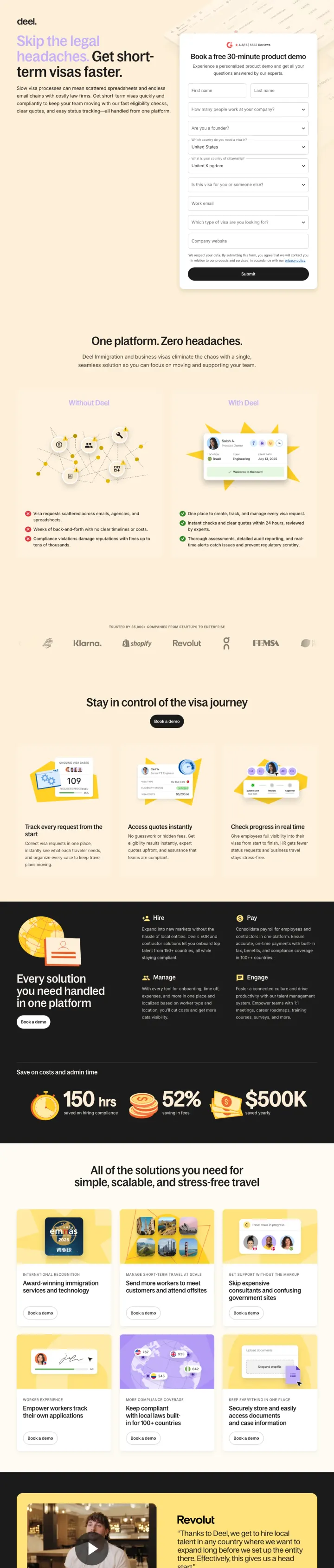
The demo form asks 8 fields including 'Are you a founder?' and 'Which type of visa are you looking for?' -- this is too many qualifying questions for a first touch and will suppress form completion rates
The '$500' price mention in the features data is never contextualized on the page -- visitors cannot tell if this is per-visa, per-employee, or per-month
The page repeats the 'One platform. Zero headaches' section twice identically in the scrape, suggesting either a rendering bug or a template error that wastes scroll depth
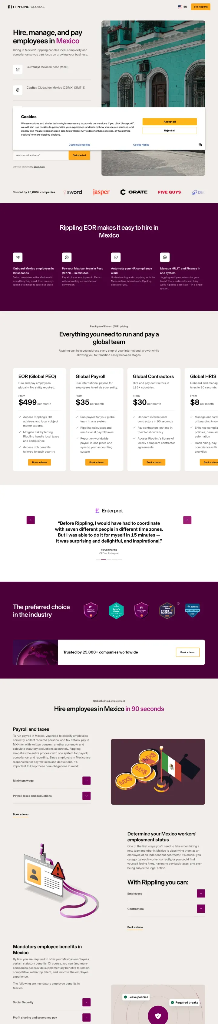
When targeting a specific country, open with quick-reference facts (currency, capital, payroll cycle, official language) as a visual checklist so the visitor immediately knows the page is built for their exact market.
Country metadata sidebar (currency: MXN, capital: CDMX, payroll cycle: biweekly, language: Spanish) instantly signals this is a purpose-built page for Mexico, not a generic 'we do global' page with Mexico mentioned in a dropdown
Specific payroll tax rates (health insurance 20.4%, retirement fund 5.15%, work risk insurance 0.67%) demonstrate operational knowledge that no generic HR platform page could credibly claim without actually operating there
Mandatory benefits section (Aguinaldo Christmas bonus, 10% profit sharing, Sunday premium pay at 125%) educates the buyer while proving Rippling handles these automatically -- the content IS the trust signal
The single email field CTA ('Get started') is too low-commitment for a $499/mo EOR decision -- visitors at this price point expect to talk to a human, and a single email field feels like a newsletter signup rather than a sales conversation
The cookie consent banner covers the bottom 40% of the viewport on first load, hiding the country metadata that would otherwise anchor the page
Competitor comparison quotes ('I feel safe with Rippling, much more safe compared to Deel') are named but feel cherry-picked -- one quote is not a pattern, and sophisticated buyers will dismiss it
Show carrier logos (Aetna, Kaiser, UnitedHealthcare) directly below your benefits headline so visitors know they are getting real insurance from recognized names, not a white-label product from an unknown vendor.
Four pricing tiers from $8/mo (payroll only) to $599/mo (EOR) let visitors self-qualify instantly without a sales call -- this directly addresses the HR buyer's #5 objection about hidden add-on fees
Carrier partner logos (Aetna, Kaiser, MetLife, UnitedHealthcare) function as trust signals that are more powerful than the vendor's own brand because HR buyers need to justify the benefits provider to their employees
Add-on pricing for time tracking ($8/mo), health insurance ($8/mo per eligible employee), and international contractors ($39/mo) makes the total cost calculable before the first conversation
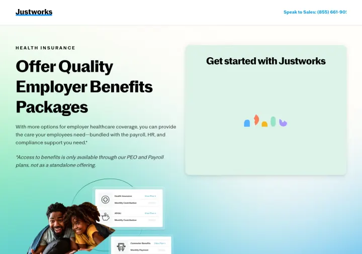
The form above the fold is nearly invisible -- 'Get started with Justworks' header appears but the form fields are cut off below the viewport, making the page feel like a content page rather than a conversion page
The asterisk disclaimer ('Access to benefits only available through PEO and Payroll plans') is buried in italics below the hero copy when it should be integrated into the pricing tiers to prevent sticker shock when visitors realize the $8 plan does not include benefits
FAQ section at the bottom asks 'Do you offer health benefits in my state?' but never answers it inline -- forcing the visitor to click through, which is exactly the kind of compliance question that should be answered immediately
1 page burning ad spend with fundamental issues
Every click to these pages costs real money. We found broken trust signals, mismatched intent, weak CTAs, and messaging that ignores what the searcher actually typed. Here is what to avoid.
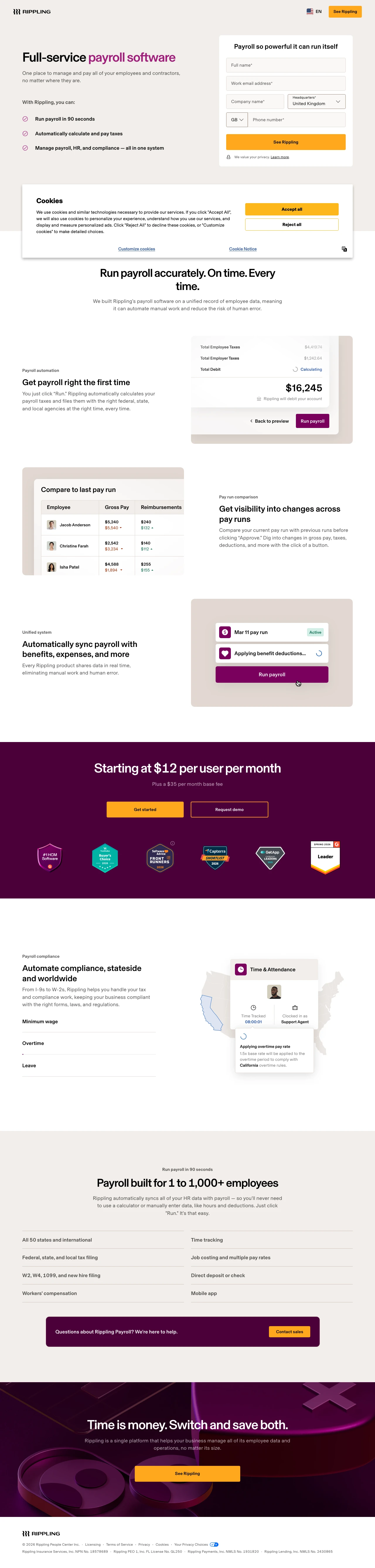
Hero form demands Full Name, Work Email, Company Name, Headquarters (a 190-country dropdown), Phone Country Code (a second 190-country dropdown), and Phone Number before the visitor sees a single pricing number -- the ad sold 'Run payroll in 90 seconds' and the page asks for two minutes of form-filling to get started
A cookie consent banner covers the bottom third of the viewport on first load, pushing the form fields and the 'See Rippling' CTA button off-screen -- the primary conversion mechanism is hidden behind a GDPR dialog on a page Rippling is paying to send traffic to
Pricing ('Starting at $12 per user per month plus a $35 per month base fee') is buried after three product-screenshot sections -- an SMB comparison-shopping between Gusto ($40/mo + $6/employee) and Rippling has to scroll past 'Pay run comparison' and 'Automatically sync payroll with benefits, expenses, and more' before they can do the math
Zero named customer logos or testimonials anywhere on the page -- Rippling has public customers (SurrealDB, Enterpret, Revolut appear on their Mexico page) but this payroll landing page relies entirely on star-rating badges, which is weaker proof for a tool that will touch every employee's paycheck
'Payroll built for 1 to 1,000+ employees' is the only sizing signal -- ADP, Paylocity, and Paycom all segment pages by company size because the feature set and pricing concerns for a 5-person startup vs a 500-person mid-market are wildly different
Justworks ($8-$599/month tiers) and Paylocity show pricing directly on their landing pages. ADP hides pricing behind 'See pricing' links that leave the page. HR buyers comparison-shop in spreadsheets with 3-5 vendors. If your page makes them leave to find pricing, they leave to a competitor who s...
BambooHR's time tracking page with an inline form converts better than their generic HR software page (now excluded). Paylocity's payroll-specific page outperforms their generic HR+payroll page. Deel builds separate pages for US payroll, visas, and PEO. When a visitor searches 'payroll software,'...
Paylocity displays G2 4.5/5, Capterra 4.4/5, and Software Advice 4.4/5 in a horizontal bar. ADP shows G2 #1 Rated alone. Three consistent ratings across independent platforms are harder to dismiss as gaming than a single award. For HR buyers making a compliance-critical purchase that touches ever...
Paycom's Prairie Knights Casino story names a specific competitor (Paylocity) the customer left and came back from. A win-back story is psychologically more convincing than a first-time adoption story because it implies the alternative was tested and found wanting. It preempts the buyer's 'but wh...
Winners show per-employee pricing, embed demo forms directly in the page, and build feature-specific landing pages for each keyword cluster. Losers hide pricing behind 'See pricing' links that leave the page, use company-size segmentation quizzes as the first interaction, and send non-brand traffic to corporate overview pages with full site navigation.