 Our AI Tools




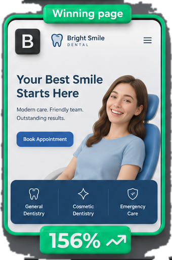




Clear headline. Strong CTA. Remove distractions. Add trust signals. Every guide to this gives you the same list, and the list is useless, because it describes what a good page looks like after the fact instead of telling you what is wrong with the page in front of you.
This is the method I actually run, in order. It came out of grading 650 real landing pages across 54 industries for our swipe file, from personal injury to B2B software to water damage restoration: 365 winners, 167 losers, 118 that could go either way.
👉 The short version
Run the six checks in order.
Checks 1 and 2 find most of the money. Checks 3 to 6 only matter once the first two are right.
The reason most landing page audits fail is that they start at check four.
Check 1: Does the page deliver what the ad promised?
This is first because it is the most common failure and the cheapest fix.
Open the ad. Read the headline. Now open the landing page and read its headline. If a stranger could not tell they belong together, stop here and fix it before anything else.

You paid for the expectation the ad created. When the page does not meet it, the visitor spends their first two seconds re-orienting instead of reading, and most of them leave during that gap.
This is not just a persuasion argument, it is scored. Google’s own guidance for a below-average landing page experience is to “keep messaging consistent from ad to landing page” and to “ensure the page follows through on the ad’s offer or call to action”. Landing page experience is one of the three components of Quality Score , alongside expected clickthrough rate and ad relevance.
The size of the effect is unusually well measured for something this cheap to fix. NextAfter ran a controlled test where the only change was matching the ad creative to the landing page, and conversions rose 47.6% across 239,607 participants .
What this looks like in practice:
- Ad says “emergency callout, 60 minutes”. Page says “Quality plumbing since 1994”.
- Ad names a price. Page hides pricing behind a form.
- Ad promotes one specific product. Page is the generic homepage.
That last one is the most expensive mistake in paid search and it is everywhere. A homepage answers a general question, while the ad made a specific promise, so the visitor arrives and has to start their search over.

Look at what that page asks of someone who just clicked an ad for one specific model. Three untouched dropdowns and a button offering 24,599 matches. They came with a question and left with a search form.
Check 2: Is the traffic even right?
The page is half the story, and this is the check almost every guide skips because it requires looking outside the page.
Before you redesign anything, pull the search terms report for the ad group sending the traffic. If a meaningful share of your spend is going on terms that were never going to convert, the page is not your problem and no amount of CRO will save it.
I have seen a “broken” landing page turn out to be fine once the negative keywords were sorted out. The page had been converting the right people all along; there just were not many of them.
Three things to look at:
- Search terms. Are these people who want what you sell, or people researching? This is where the negative keyword list earns its keep, and where a broad match keyword quietly widens who is arriving.
- Device split. Some gap between mobile and desktop is normal, not a fault: Contentsquare’s 2026 benchmark across 99 billion sessions found desktop converting 74% higher than mobile while mobile carried 69.9% of the traffic. What you are looking for is a gap much wider than that, on a page taking most of its clicks from phones.
- Ad group to page ratio. Twenty ad groups pointing at one page means twenty different promises landing in the same place.

That is the report. Mobile is taking three quarters of the clicks on that ad group, so anything wrong with the mobile page is wrong with three quarters of the spend.
Checks 1 and 2 are where the money is
If you only ever do two things, do these.
They are also the two that no landing page analyzer can do for you, because both require seeing the ads as well as the page, and every tool on the market only looks at the page. That is the reason they get skipped, not because they matter less.
Check 3: What does this page want, and is that one thing?
Count the actions available. A form, a phone number, a chat widget, a newsletter signup, a nav bar with nine links, a footer with thirty.

Every one of those is a choice, and choices cost conversions. The underlying research is Iyengar and Lepper’s jam experiment , published in the Journal of Personality and Social Psychology: shoppers offered 6 jams bought at 30%, shoppers offered 24 bought at 3%.
The nuance the best-practice lists get wrong: stripping every option is not automatically right. In the high-stakes verticals in our swipe file, personal injury, addiction treatment and water damage restoration, it is common to see both a phone number and a form, because someone in genuine trouble at 2am wants to talk to a person and someone researching quietly at work does not.

The jam researchers carved out this exception themselves. More options help, they wrote, “in preference-matching contexts, in which people enter hoping to find some particular product or service they already know themselves to prefer”. Someone whose boiler has failed knows exactly what they want. They just need the fastest route to it.
The rule is not “one CTA”. It is one job, with the routes a real buyer would actually take.
Check 4: Is the offer clear in five seconds?
Look at the page for five seconds, then look away and answer three questions:
- What is being offered?
- Who is it for?
- What happens if I click the button?
If any answer is missing, that is the fix. This is where most pages actually fail, and it is almost always a copy problem rather than a design one.
Question three is the one people forget. “Get started”, “Learn more” and “Submit” all hide what happens next. The pages that work tend to tell you what comes next: get my free quote, book a callback, see pricing.

That headline answers all three questions before you have scrolled. What: accountancy. Who: small businesses. What happens if I click: I get an instant quote, at a price already on the page.
Check 5: What has to be true for someone to buy, and is it on the page?
Not “add trust signals”. That is the advice everyone gives and it produces a wall of meaningless logos.
Instead, write down what a specific buyer needs to believe before they act, then check whether the page addresses it. This changes enormously by industry, and it is the check where our corpus was most useful.
When we built the swipe file we did not sort the 54 industries alphabetically. We sorted them by the buyer’s situation, because that is what actually decides what a page has to do:

| Buyer situation | What they need to believe | How our graded pages fell |
|---|---|---|
| Urgent need | You will actually turn up, fast | 3 of 10 graded winners |
| High stakes (legal, medical, addiction) | You have handled my exact situation before | 124 of 266 |
| Considered (B2B software, services) | This will not be a nightmare to implement | 159 of 284 |
| Commodity comparison | This is a fair price and there is no catch | 8 of 15 |
Those counts are what our grading recorded, not a claim about why any page won. The urgent-need row is the one worth staring at: it is the situation where the buyer is most motivated, and the smallest share of pages we looked at were doing it well.

“There is no catch”, made literal. Both prices shown together, and the cancellation terms sitting next to the discount instead of buried in a footer.

And “you have handled my exact situation before”, answered with a number in the first line rather than with a wall of badges.
A page can be beautifully designed and still fail because it never addresses the one objection that actually stops people. This is the part of the method that changes most between verticals, which is exactly why a generic checklist cannot do it for you.
Check 6: The mechanics
Last, not first, because these rarely decide anything on their own. They are also the four with the best public research behind them, so you do not have to guess at the size of the problem.
- Speed. Deloitte Digital measured 37 retail, travel and lead-generation brands for Google and found that a 0.1 second improvement in mobile load time lifted retail conversions 8.4% and travel conversions 10.1% . A tenth of a second.
- Mobile. Not “is it responsive” but “can I complete the form with my thumb on a train”.
- Form length. Every field costs you completions. Baymard Institute’s 2024 benchmark found the average checkout runs 11.3 fields when most sites need only 8 , and 17% of users have abandoned a purchase because the flow was too complex. That is checkout research rather than lead-gen, so read it as direction rather than as your number.
- Tracking. If conversions are not recorded properly, everything above is guesswork. Check your conversion tracking before you trust any of your numbers, including the ones in check 2.
The order matters more than the checks
Most audits I see start at check four, because copy and design are the visible, fun parts. Then they produce twenty recommendations, the client implements six, and nothing moves, because the ad promised something else and half the traffic was never going to buy.
Six checks is a lot to hold in your head. The alignment chain diagnosis reads the page and says which link broke first.
Run them in order. Fix what you find at check one before you look at check two. It is less satisfying and it works better.
If you would rather have the audit, the fix and the A/B test run for you, that is the conversion rate optimization service , and the first audit is free either way.
- How do I analyse a PPC landing page?
- Work in this order: does the page deliver what the ad promised, is the traffic right, is there one clear job, is the offer clear in five seconds, does the page address what the buyer needs to believe, and finally the mechanics like speed and form length. Starting with design and copy is the most common mistake, because a mismatched ad or the wrong traffic will beat any amount of page polish.
- What is the most common problem with PPC landing pages?
- Sending paid traffic to a homepage. The homepage answers a general question while the ad made a specific promise, so the visitor arrives and has to start their search again. It is also the easiest to fix, because the page usually already exists somewhere on the site.
- How many CTAs should a PPC landing page have?
- One job, but not necessarily one button. In high-stakes and urgent verticals the winners often offer both a phone number and a form, because different buyers in the same situation want different routes. What hurts is offering several different jobs at once, such as a form plus a newsletter signup plus a full navigation bar.
- Should I fix my landing page or my keywords first?
- Check the search terms report before redesigning anything. If a large share of spend is going to terms that were never going to convert, the page is not the problem and improving it will not help. This is the check most landing page audits skip because it means looking outside the page.
- How long should a PPC landing page be?
- It depends on the decision. Low-friction purchases do well with short pages. High-stakes considered decisions like legal or medical often do better with long pages, because someone facing a serious problem reads everything. Look at what is actually running in your vertical rather than applying a general rule.
- Do I need a separate landing page for every ad group?
- Not every one, but every distinct promise needs its own page. If twenty ad groups point at one page, that page is trying to keep twenty different promises and will keep none of them well. Group by what the ad claims, not by keyword count.
Once the six checks say what is wrong, the question is where to build the fix. The landing page builder comparison covers seven builders on the two numbers that matter for paid traffic, and the ClickFunnels alternatives post has the two-minute check for whether you need a funnel or a page.
What to do with this
Take one campaign, not your whole account. Run the six checks on the page behind your highest-spending ad group and write down what you find at each step.
You will usually find the answer in the first two.
The 6-check audit, as a copy-paste checklist
PPC LANDING PAGE AUDIT
Page: ____________________  Ad group: ____________________  Spend/mo: ______

CHECK 1  DOES THE PAGE DELIVER WHAT THE AD PROMISED?
[ ] Ad headline and page headline read as the same promise
[ ] The specific thing the ad named is above the fold on the page
[ ] Not sending this traffic to the homepage
    Worst mismatch found: ____________________

CHECK 2  IS THE TRAFFIC EVEN RIGHT?          (pull the search terms report first)
[ ] Search terms are buyers, not researchers
[ ] Mobile/desktop conversion gap is not far worse than the ~57% benchmark
[ ] Fewer than ~5 ad groups pointing at this one page
    % of spend on terms that were never going to convert: ______

CHECK 3  WHAT DOES THIS PAGE WANT, AND IS THAT ONE THING?
[ ] One job, not several
[ ] Every route offered is one a real buyer in this situation would take
[ ] Nav, chat, newsletter and footer links are not competing with the job
    Actions counted on the page: ______

CHECK 4  IS THE OFFER CLEAR IN FIVE SECONDS?     (look away, then answer)
[ ] What is being offered? ____________________
[ ] Who is it for? ____________________
[ ] What happens if I click the button? ____________________

CHECK 5  WHAT HAS TO BE TRUE FOR SOMEONE TO BUY?
[ ] Buyer situation named (urgent / high stakes / considered / commodity)
[ ] The single belief they need: ____________________
[ ] The page actually addresses it, in the copy, not in a badge

CHECK 6  MECHANICS                                (last, not first)
[ ] Mobile load time measured, not assumed
[ ] Every form field earns its place
[ ] Thumb-completable on a phone
[ ] Conversion tracking verified before trusting any number above

FIX ORDER: whatever you found at check 1, then check 2. Stop there and ship it
before touching anything below.
P.S. If you want to see what winning pages look like in your vertical rather than in the abstract, we published the graded examples across 54 industries . And if you would rather have software do the first pass, paste it into our free landing page analyzer .